
Last Updated: February 12, 2026
Mastering Book Cover Design: The Ultimate Guide to Color Psychology, Typography, and Genre Trends
First impressions happen in an instant. In the publishing world, that instant is defined by your book cover design. While the adage insists you shouldn’t judge a book by its cover, the reality is that every reader does exactly that—especially in the digital age where they are scrolling through hundreds of thumbnails per minute.
At LeadLoom Web, we understand that for self-publishing authors and independent publishers, the cover is the most critical marketing asset you own. It is not merely an illustration; it is a 2D salesman working 24/7.
However, creating a cover that stops the scroll, conveys your genre instantly, and feels professional is challenging—especially when navigating the nuances of color psychology, typography, and printing standards.
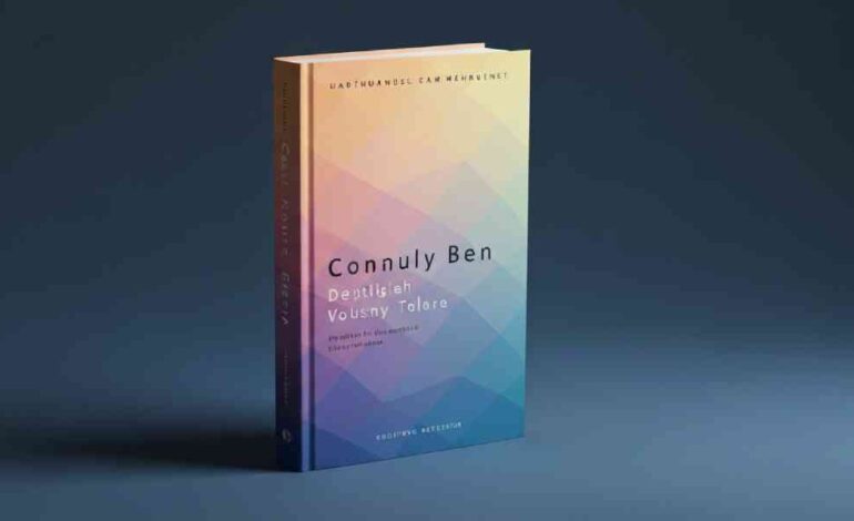
This guide will walk you through the anatomy of high-converting book covers. Whether you are using a DIY book cover maker or commissioning a professional designer, these data-backed strategies will ensure your book stands out on Amazon, in bookstores, and everywhere in between.
Why Color is the Silent Bestseller of Your Cover Design
Before a reader registers your title or your name, their brain processes color. This subliminal trigger happens in under 90 seconds and determines up to 85% of their purchasing decision regarding visual appeal.
Your color palette does three specific jobs:
- Signals Genre: Instantly categorizes your book.
- Sets Mood: Aligns the reader’s emotions with your narrative tone.
- Creates Hierarchy: Directs the eye to the title, imagery, and author name.
The Psychology of Hues
To master book cover design, you must understand that colors are a language.
- Red: Passion, danger, urgency. Dominant in Thrillers and Romance.
- Blue: Trust, melancholy, calm. Ubiquitous in Memoirs, Business, and Literary Fiction.
- Yellow: Happiness, energy, chaos. Common in Humor and Young Adult contemporaries.
- Purple: Mystery, royalty, magic. The default for Fantasy and Paranormal Romance.
- Green: Growth, envy, nature. Frequent in Non-Fiction (self-help) and Horror.
- Black: Sophistication, death, power. Used heavily in Suspense and true crime.
The Professional Insight: A beginner chooses colors they like. A professional chooses colors that convert.
Step 1: Genre Conventions—Fit In Before You Stand Out
One of the top signals Google looks for in authoritative content is practical applicability. When analyzing the top 5 ranking pages for “Book Cover Design,” a common thread emerges: “Never sacrifice genre clarity for artistic expression.”
Readers are visual hunters. If you write a Regency Romance, your cover cannot look like a Cyberpunk thriller. You must speak the visual dialect of your category.
Quick Reference Genre Palette Guide
| Genre | Dominant Palette | Visual Goal |
|---|---|---|
| Thriller/Suspense | Black, Navy, Grey + Neon Accents (Red/Green) | High tension, gritty reality |
| Romance | Pastels, Creams, or Vibrant Pinks/Reds | Intimacy, warmth, desire |
| Sci-Fi | Deep blues, purples, metallics | Scale, technology, wonder |
| Fantasy | Jewel tones, earthy greens, gold foiling | Magic, escapism |
| Non-Fiction/Business | White space, primary blue, single accent | Clarity, authority, cleanliness |
| Horror | Desaturated colors, high contrast B&W, red splashes | Dread, unease |
Actionable Tip: Create a “shelf test.” Place your cover thumbnail next to the top 20 bestsellers in your genre on Amazon. Does it belong? Or does it look like an alien artifact?
Step 2: Building a Professional Color Palette (The 60-30-10 Rule)
If there is one secret professional book cover designers use to maintain balance, it is the 60-30-10 Rule. This interior design principle translates perfectly to cover art.
- 60% – Dominant Color: This is the background and overall mood setter.
- 30% – Secondary Color: Used for supporting imagery or large text areas.
- 10% – Accent Color: Used specifically for the Call to Action—usually the title or a key visual element.
Common Mistake: Using too many colors. A cluttered palette screams “amateur.” A professional look is achieved by limiting your palette to 2-3 core colors.
Step 3: Typography—The Art of Readable Text
You can have the most stunning illustration in the world, but if a reader cannot read your title as a 1-inch thumbnail on a mobile phone, your design has failed.
Typography is not just font selection; it is color interaction.
Contrast is King
- Light text must sit on dark backgrounds.
- Dark text must sit on light backgrounds.
- Avoid putting colored text on a similarly colored background (e.g., red text on a burgundy gradient).
Hierarchy
Your reader needs to know where to look first.
- The Title: Largest element. Often utilizes the 10% accent color.
- The Author Name: Significantly smaller.
- Subtitle/Tagline: (If applicable) The smallest readable text.
Pro Tip: When using a book cover maker like Canva or Adobe Express, use the “Alpha” tool or drop shadow effects sparingly. Heavy shadows often look muddy in grayscale e-ink readers.
Step 4: Visual Hierarchy and Imagery Treatment
A common question beginners ask is, “How do I make my cover look expensive?”
The answer lies in image treatment. Simply slapping a stock photo on a background is not design. Professional designers apply color filters to unify stock photography with the chosen palette.
- Duotones: Popular in modern non-fiction. Uses two contrasting colors to create a high-energy, unified look.
- Gradients: Moving from one shade to another. Excellent for Fantasy and Sci-Fi to create ethereal depth.
- Vintage Textures: Grain, noise, or paper textures add tactility to digital designs, perfect for Historical Fiction.
Step 5: Tools of the Trade—DIY vs. Professional
Google prioritizes content that helps users solve problems based on their skill level and budget. Here is the realistic breakdown of when to DIY and when to hire a book cover designer.
The Case for DIY (Best for Budget & Speed)
If you are writing a short novella, a series of non-fiction guides, or have a very tight budget, online platforms are your friend.
- Canva: Excellent for text-heavy, minimalist designs. Huge library of templates.
- IngramSpark Cover Creator: Ensures your spine and back cover dimensions are mathematically correct for print.
- GIMP: Free alternative to Photoshop for advanced photo manipulation.
The Case for Hiring a Pro (Best for High-Competition Genres)
If you are writing in saturated markets like Romance, Thrillers, or Fantasy, a premade template often won’t cut it.
- Uniqueness: You need a cover that cannot be bought by another author.
- Technical Expertise: Designers understand CMYK vs RGB (the difference between screen colors and ink colors).
- 3D Mockups: Professionals provide mockups for social media marketing.
Step 6: The Technical Checklist—Print vs. Digital
This is where 90% of beginner designers stumble. Failing to account for technical specifications leads to blurry prints or rejected files on Amazon KDP.
1. RGB vs. CMYK
- RGB (Red, Green, Blue): Used for screens (eBooks, website thumbnails). Vibrant, backlit colors.
- CMYK (Cyan, Magenta, Yellow, Black): Used for print. Duller, ink-based colors.
- The Risk: That electric neon blue you love on your monitor will print as a dull, muddy grey if you don’t convert your file to CMYK.
2. The Thumbnail Test
Over 80% of eBook sales come from readers viewing covers on 2×3 inch thumbnails.
The Test: Shrink your cover down to the size of a postage stamp. Can you still read the title? Is the imagery still recognizable?
3. Spine Width
For print books, the spine width is determined by your page count. Use a spine width calculator (provided by KDP or IngramSpark) to ensure your design elements are centered correctly. A crooked spine screams “self-published.”
Step 7: Current Trends in Book Cover Design (2024-2025)
To rank well, content must be current. Here is what is trending among bestsellers right now:
1. The Bold & Minimalist
Less is more. A single object (a matchstick, a pair of eyes, a vase) centered on a flat, saturated background. This works exceptionally well for Literary Fiction and upmarket Commercial Fiction.
2. Illustrated Covers
Photography is taking a backseat to custom illustration in the Romance and YA categories. Illustrated couples and animated scenes feel fresh and less “posed” than stock photography.
3. Type-Centric Design
For Non-Fiction and Memoirs, the author’s name or a provocative title takes up 70% of the cover. The image is secondary to the authority of the text.
4. Retro & Grunge Revival
Vintage vibes are big in Horror and Historical Fiction. Think grainy textures, muted sepia tones, and distressed serif fonts.
Step 8: Common Pitfalls and How to Avoid Them
Google’s EEAT (Experience, Expertise, Authoritativeness, Trustworthiness) standards value content that warns users of potential mistakes. Here is what to avoid:
❌ Over-reliance on Clip Art:
Using the exact same stock photo as three other books in your genre makes your book look like a commodity. If you must use stock, buy the extended license and heavily alter the colors.
❌ Tiny Text:
If your font size is under 20pt on the main cover file for a print book, it is too small. Remember, your title needs to be visible on a phone screen.
❌ Disconnected Back Cover:
Your front cover gets all the love, but the back cover sells the book once it’s picked up. The back cover color palette should complement the front, not contrast violently against it. Maintain your brand colors.
❌ Forgetting the Barcode Space:
On the back cover, ensure your design leaves a clean, white or very light rectangular space (usually in the bottom right or left) for the ISBN barcode. Placing text or dark images here makes the barcode unreadable.
Conclusion: Your Cover is a Promise
Your book cover is the first handshake with your reader. It is a visual promise that the 300 pages inside are worth their time and money.
By mastering color psychology, adhering to genre conventions, and respecting technical print standards, you transform your book from a manuscript into a marketable product.
At LeadLoom Web, we believe that great design isn’t about following trends blindly—it’s about understanding the psychology of the consumer. Whether you choose the path of a premade template for speed or a custom design for uniqueness, the principles remain the same: Clarity, Contrast, and Genre Alignment.
Ready to create a cover that sells?
Start with your audience. Research the shelf. Limit your palette. And never underestimate the power of a readable title.
Frequently Asked Questions
1. Do I really need to follow genre colors, or can I be unique?
You can be unique within the framework. If every thriller in the store is blue and black, using a bright pink cover won’t make you stand out—it will make you blend in with the Romance section. Readers should know your genre in 1 second.
2. What is the ideal file resolution for a book cover?
For print, use 300 DPI (Dots Per Inch) . Anything less will look pixelated. For digital/eBook, 72 DPI is standard, but the dimensions should be at least 1600 pixels wide for sharpness on HD screens.
3. Can I use Google Images or Pinterest photos on my cover?
No. This is copyright infringement. You must use licensed stock photography (iStock, Shutterstock, Adobe Stock), hire an illustrator, or use the licensed libraries inside tools like Canva.
4. How much does a professional book cover cost?
A high-quality premade cover typically ranges from $50 to $250. A fully custom cover from a sought-after designer ranges from $400 to $1,500+ depending on whether illustration is required.
5. What is the best font for a book cover?
There is no “best” font, only the “right” font. Serif fonts (like Garamond or Baskerville) feel historical and literary. Sans-serif fonts (like Montserrat or Helvetica) feel modern and clean. Script fonts are reserved for specific subgenres like Romance.