Creative event management logo ideas Guide
You’ve planned dozens of flawless events. But when potential clients discover your business online, does your logo make them stop scrolling—or keep scrolling past you?
In the event industry, your logo isn’t just a graphic. It’s your handshake before you meet. Your reputation before you speak. And for small business owners competing against established firms, it’s often the difference between “tell me more” and “next result.”
I’ve spent years designing brand identities for event planners, wedding coordinators, and corporate event startups. Here’s the truth most “logo idea” articles won’t tell you: Generic advice produces generic logos. And generic logos get ignored.
This guide isn’t a list of vague suggestions. It’s a prescriptive blueprint—with specific examples, platform recommendations, and design strategies—to help you create an event management logo that builds trust and wins clients.
What Actually Makes an Event Management Logo “Creative”?
Let’s kill a myth first.
Creativity isn’t complexity. The most successful event logos aren’t the ones with five icons, three fonts, and a gradient. They’re the ones you recognize instantly, remember days later, and trust immediately.
A truly creative event management logo does three things:
- Signals your specialty (weddings, corporate, nonprofits) within 2 seconds
- Communicates your price point without saying “luxury” or “budget”
- Works everywhere—from an Instagram avatar to a 20-foot banner
Most small business logos fail because they try to say everything and end up saying nothing.
4 Specific Logo Concepts That Work for Small Event Businesses
Forget “use elegant fonts.” Here are four distinct, proven logo directions—with exactly who they’re for and why they work.
1. The Single-Line Minimalist
Best for: Corporate event planners, high-end wedding coordinators, venue owners
What it is: A continuous, unbroken line that forms one event-related symbol. A chair. A bouquet silhouette. A stage arch.
Why it works: Single-line logos are the little black dress of branding. They never look dated. They scale perfectly. And in a portfolio filled with clip-art confetti, they signal confidence.
Example in action:
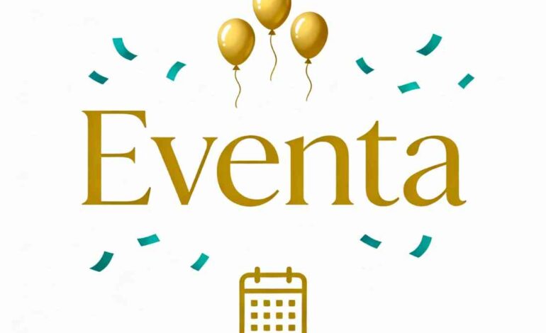
2. The Typographic Monogram
Best for: Multi-planner firms, established businesses, planners targeting corporate clients
What it is: Your company initials arranged as the primary logo element, with your full name as secondary text.
Why it works: Clients remember initials. Think LV, MK, DG. A well-crafted monogram feels like a heritage brand—even if you launched last month.
Design rule: Pair one serif font (traditional, elegant) with one sans-serif (modern, clean). Never use two script fonts together.
Example:
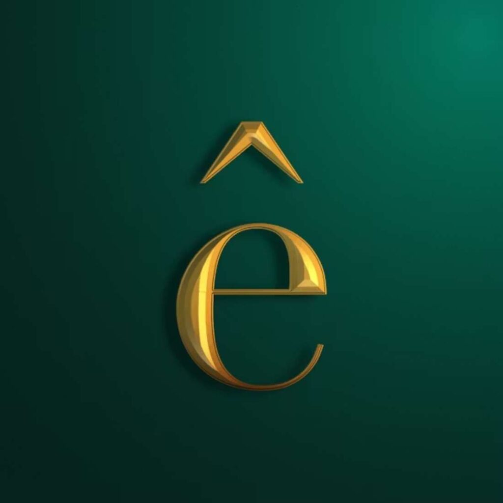
3. The Embedded Symbol
Best for: Niche specialists (destination weddings, eco-friendly events, cultural celebrations)
What it is: An event symbol hidden inside your typography. The crossbar of an “A” becomes a horizon line. The dot of an “i” becomes a tiny star. A letter’s stem curves into a microphone stand.
Why it works: It rewards attention. Clients feel clever when they notice the hidden element—and that positive emotion transfers to your brand.
Example:
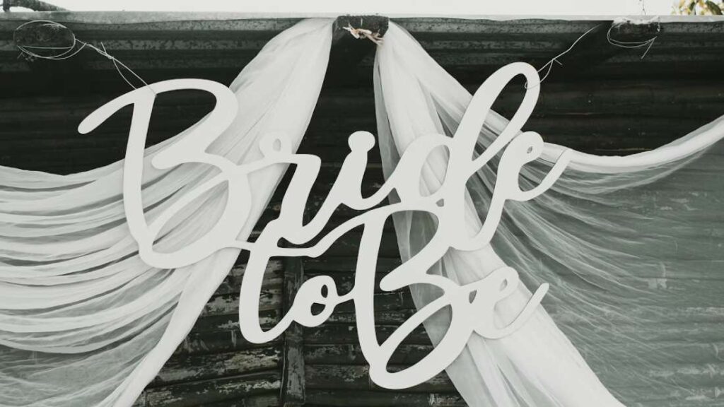
4. The Shield or Crest
Best for: Heritage-focused brands, venues, planners specializing in generational events (anniversaries, galas)
What it is: Your business name enclosed within a defined shape—a circle, a shield, a vintage frame.
Why it works: Shapes communicate stability. A crest says, “We’ve done this before. You’re in safe hands.”
Example:
![]()
Caution: This style requires professional execution. Amateur crests look like clip art. Invest in a freelancer if this is your direction.
Step-by-Step: How to Create Your Event Logo (Even If You’re Not a Designer)
Phase 1: Discovery (1 Hour)
Before you open any software, answer these four questions:
-
- What type of event defines 80% of your revenue?
Weddings? Corporate retreats? Nonprofit fundraisers? Your logo should reflect your primary income source—not the event you wish you booked more. - Who is your ideal client?
A 28-year-old bride planning her first wedding? A Fortune 500 executive organizing a sales kickoff? A nonprofit director coordinating a charity gala? - What’s your personality spectrum?
Mark where you fall:
- What type of event defines 80% of your revenue?
| Traditional | Modern | |
| Formal | Casual | |
| Ornate | Minimal | |
| Colorful | Monochrome |
- What’s your brand color constraint?
If you already have a website, venue, or uniforms with existing colors—your logo must work with them, not against them.
Phase 2: Inspiration (2 Hours)
Do not open Canva yet.
Do create a private Pinterest board called “Event Logo Inspiration.”
Save:
- 10 logos you love (from any industry)
- 10 event-specific logos
- 5 typography samples (fonts, lettering styles)
- 5 color palettes
Now look for patterns. Do you keep saving crests? Sans-serif wordmarks? Illustrative icons?
Your logo direction is the pattern, not any single pin.
Phase 3: Creation (Platform-Specific Guides)
Option A: $0–$50 (DIY Design)
Canva (Desktop or Mobile)
- Search “Event Logo” templates
- Select a template with one icon maximum
- Replace colors using your brand palette
- Export as SVG (for websites) and PNG (for social media)
Looka (AI-Powered)
- Answer the brand personality quiz
- Review 50+ AI-generated concepts
- Select your favorite, customize colors/fonts
- Purchase high-res files ($20–$65)
Hatchful (Shopify’s Free Tool)
- Select “Events” industry
- Choose visual style (masculine, feminine, playful)
- Generate unlimited variations
- Download complete brand kit (free)
Option B: $100–$500 (Freelancer)
Where to hire:
- Fiverr Pro: Search “event logo.” Filter by Pro Verified. Look for portfolio examples containing wedding or corporate branding.
- 99designs: Launch a contest. You’ll receive 30–50 concepts. Pay only for the winning design.
What to provide your designer:
“I need a logo for [business name], an event planning company specializing in [niche]. Our ideal clients are [description]. We prefer [minimalist/crest/typographic] styles. Our existing brand colors are [hex codes]. We need [primary logo, icon only, horizontal version]. Our budget is [amount].
Option C: $1,000+ (Design Agency)
Only necessary if you need:
- Full brand guidelines (40+ page document)
- Custom illustration or iconography
- Multiple brand touchpoints (logo, stationery, signage, social templates)
Platform Breakdown: Where to Design or Hire
| Platform | Best For | Price Range | Skill Level |
|---|---|---|---|
| Canva | DIY logos, social graphics | Free–$15/month | Beginner |
| Looka | AI-generated concepts | $20–$65 one-time | Beginner |
| Hatchful | Free brand kits | Free | Beginner |
| Fiverr | Budget-friendly freelancers | $100–$500 | Client |
| 99designs | Multiple concepts, contests | $299–$999 | Client |
| Dribbble | High-end designers | $1,000+ | Client |
5 Logo Mistakes That Make Small Event Businesses Look Amateur
-
- Too Many Icons
Three icons isn’t creative—it’s confusing. A microphone, champagne glass, and calendar tell me you do everything. Which means you’re the expert in nothing. - Default Canva Fonts
If your logo uses Arial, Times New Roman, or any font that came pre-installed on a 2005 computer, you look like a hobbyist. Customize or upgrade. - Raster Images (JPG/PNG Only)
Logos created and saved only as JPGs pixelate on large prints. Always request or export an SVG or EPS vector file. - Following Trends Blindly
The “bubble letter” trend, the “neon gradient” trend, the “hand-drawn doodle” trend. Trends date your logo within 18 months. Classic scales - No Lockup Variation
You need three versions:
– Horizontal (website header)
– Stacked (social avatar)
– Icon only (favicon, app)
- Too Many Icons
Real Examples: What Successful Event Logos Do Differently
Before: A wedding planning logo with a script font, a watercolor bouquet, and three pastel colors.
Problem: Beautiful, but illegible at thumbnail size. No brand recognition.
After: The same business with a single-line bouquet silhouette, one refined serif font, and a two-color palette.
Result: Clients remembered the shape. Recognition increased. Inquiries rose.
Before: A corporate event logo with a generic globe icon, bold sans-serif font, and navy blue.
Problem: Looked like every other corporate vendor. No differentiation.
After: A custom monogram combining the founders’ initials, embedded into a shield shape.
Result: Perceived as a legacy firm. Closed three enterprise contracts within two months.
Your 7-Day Logo Action Plan
| Day 1 | Complete the Discovery worksheet above |
| Day 2 | Build your Pinterest inspiration board |
| Day 3 | Decide: DIY, Freelancer, or Agency |
| Day 4 | Create (or brief) your first concepts |
| Day 5 | Refine based on the 3-Second Test* |
| Day 6 | Export all required file formats |
| Day 7 | Update your website, email signature, and social profiles |
*The 3-Second Test: Show your logo to someone for three seconds. Hide it. Ask what they remember. If they can’t describe the shape or symbol—simplify.
Your Logo Opens Doors. Your Brand Keeps Them Open.
A professional logo gets you noticed. It tells potential clients, “This business is legitimate. This business is established. This business is worth my budget.”
But a logo alone won’t build your brand.
Your website, your proposals, your email communication, your on-site presentation—they must all deliver the same promise your logo makes.
At LeadLoom Web, we build complete digital identities for event businesses. From custom logo design to full-service websites that convert visitors into booked clients.